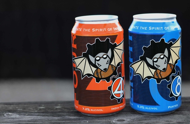
(Flying Mouse Brewing Company uses as mascot as its brand identity)
By Jeff Maisey
Adam Applegate, a relative newcomer to the world of craft beer, ventures off to a grocery store to purchase some brews to bring to a gathering of friends. Applegate is immediately overwhelmed by the selection of beer on the shelves of the retailer.
While Applegate is aware of some brands he has tried at local restaurants and bars, selecting “the right” six-pack is becoming a daunting task. So many choices.
For breweries, customers like Applegate represent an opportunity. He can pick any beer on the shelf. But the increasingly challenging question for craft breweries is this: How can I stand out from the pack?
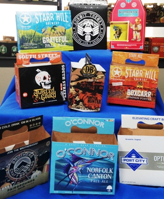
“We hear a lot of distributors talk about how there are so many new beers being packaged,” said Dave Hayslette, director of business development at Richmond-based West Rock Company. West Rock Company manufactures the paperboard that many craft breweries use for their six-pack carriers, can cartons and 12-pack boxes. Historically, for some of the smaller volume companies West Rock has partnered with Carded Graphics of Staunton, Virginia as well as other printers around the country. Among West Rock’s clients are Devils Backbone, Starr Hill, Parkway Brewing, Strangeways, and such national brands as Sixpoint Brewing, Magic Hat, Ballast Point Brewing and New Belgium’s Asheville, North Carolina facility.
Hayslette and Christine Kelley, vice president of business development at Carded Graphics, are in agreement on nearly aspect of the packaging side of the business.
(What does the packaging communicate about the brand/brewery?)
“Most people are drawn by what they see,” said Kelley. “People shop with their eyes, they always have. If they’re not familiar with the brand and see something that catches their eye on the shelf that might differentiate it from something else they’ll give it a try.”
“There was 134% growth in the number of skews on the shelf in a typical craft section of a big box grocery last year,” said Hayslette. “With that kind of proliferation of skews the great quality of liquid is a critical component but you also have to make the package appear distinct. We work with brands through our design team to develop distinctive structures and graphics to help tell the story of the brand. Distinctive doesn’t necessarily mean fancy or high gloss, premium packaging. Sometimes that isn’t what’s construed to be appropriate for the craft industry where it is all about authenticity, craftsmanship and an artisan product. You can get differentiation on the shelf in a number of ways without appealing too slick and commercial.”
Craft beer consumers are also a different breed from the folks who purchase large scale mainstay brands.
“What we know from our research is the typical beer consumer that buys Budweiser or Miller spends on average 30 seconds in the beer aisle looking for his beer, Hayslette said. “He’s really not shopping; he’s essentially buying because he’s a creature of habit. On Friday afternoon, he buys his 24-pack Bud Light and he’s done.
“By contrast, the craft beer consumer averages 4-1/2 minutes in the aisle. In that time, when we’ve interviewed them, they basically characterize the experience as comparable to when you’re in a record store. You’re thumbing through looking for the next new band that your friends haven’t heard of and you haven’t heard of. You want to discover something new. You have your tried-and-true. You know who your go-to bands are or your go-to beers, but you’re constantly discovering and looking to explore and try something you haven’t experienced before.
“We also know that of the consumers who go in with the intent to buy craft beer about 70% will say they know what they intend to buy when they go in the store. Of those 70% going in knowing what they want to buy, half of them will say they’re also open to buying something different that wasn’t on their original list. They will spend the time in the aisle looking for new things. The folks we interviewed used terms like “discovery” and “exploring.”
“So we will work with these brands to help them think about how they can make their packaging stand out and make it appealing. We try to connect with the brewery owners and understand what their story is. What is the brewery about? What’s their back story? What is the origin of the brewery? We then try to use the actual package as a canvas to tell that story. You can tell it with graphics. You can tell it with structure. You can tell it with color. There are a number of ways to convey that imagery and that brand.”
Carded Graphics has seen many of its clients take advantage of new techniques in packaging to help hook the customer’s sensory overloaded eye.
“We’re probably one of the most modern folding carton companies in North America,” Kelley said. “We’ve invested in a lot of technology that allows us to bring in high-end special effects. It allows the brewers to have a spot-gloss effect or metallic ink – things they couldn’t do in the past because it wasn’t available. By creating that different container on the shelf it really has an impact on the consumer. They say 85% of people that pick it up off the shelf are going to put it in the cart, and that’s what you’re looking for the customer to do.”
One of the developing trends in craft beer is breweries converting to a cardboard container for their six-pack of cans.
“What’s driving that is 1) the plastic clips are not recyclable 2) if the cans are not fronted, meaning the cans are not facing out, then it could be sitting of the shelf and the customer could be looking at the barcode,” Hayslette said. “So along we come with the fully enclose cartons – you’ve got all four sides of these packages a complete billboard that describes the brewery, the brand and a description of the beer type and style.”
For established craft breweries like Starr Hill, keeping things current with through packaging is another new trend as they try to appeal to customers who are searching for the “new.”
“The trend is that a lot of breweries are redeveloping some of their artwork,” said Kelley. “They had the same brand and idea for a long time, and now they have options to refresh that. We’re seeing that a lot across the board – refresh, rebrand.”
“For our new brand packaging, Starr Hill sought to create a clean, consistent packaging that was authentic to our roots in Central Virginia and music,” said Jack Goodall, Starr Hill’s public relations guy. “The consistency comes through the placement and hierarchy of the brewery name, brand name and style name. With several of our previous packaging designs, these items changed or were difficult to decipher. The simplicity of the color schemes also gives a clear identity to the individual brands, which carries through on tap badges, master cartons and other materials. The bright colors draw you in, but the simple color schemes and designs are not overly busy or ‘heavy.’ Many of our new designs are a scene set in our local area or a far-off location where the viewer can feel transported there while enjoying some great beer.”
The theme of consistency is echoed by everyone associated with the craft beer industry.
“We’ve seen a lot of things come through here, but I think there is something to be said for continuity across your brand,” said Sten Sellier of Beltway Brewing Company. Beltway, based in Sterling, Virginia, is a contract brewery that serves breweries in need of additional off-site capacity as well as a base for gypsy brewers. “You need to be unique and you need to design a brand identity and make sure it is consistent through the different beers you make so that when you have a new beer come out consumers can see that and say, ‘Oh, here’s another one from such-and-such brewery.’ That’s a really nice way for a consumer to develop a relationship with each brewery.”
“Breweries need to invest in getting their brand image built because it is going to convey to their glassware, tap handles, T-shirts, and baseball hats all the way to their packaging,” Hayslette said. “When small micro breweries start one of the key symbols of the brewery is the tap handle. So it becomes an icon. Then that imagery needs to carry through to their packaged beer.”
There are many views on tap handles. Should the tap have a specific color? What should the tap handle look like? What does it say about your brand?
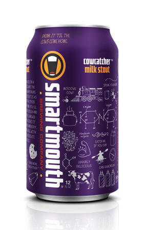
(Smartmouth designs its packaging so the logo is visible on 3 sides of its cans)
For Norfolk’s Smartmouth Brewing Company, less is more was the goal for the brewery’s logo and a bright primary color was essential.
“Our philosophy on the design of the cans and the simplicity of the logo was we wanted to stand out by simplifying,” said Porter Hardy IV, president of Smartmouth Brewing Company. “Sometimes logos get intricate, and we were trying to go opposite the herd and get a more modern, scaled-down logo. We wanted it to standout against the other logos while keeping the focus on the beer as opposed to an ornate logo.
“Having red tap handles was a big part of it so it stood out in dark places where there were a lot of taps. We wanted a color most people weren’t using that worked with our logo.”
Red was also an attention getter for Wendy Hallock, co-owner of Calloway’s Chaos Mountain Brewing.
“I did a lot of reconnaissance and found, for me, the oranges, yellows and reds were something that really stood out,” she said. “When you think of 50 tap handles, how does yours stand out? I wanted to do the graduated color that includes that red, burnt orange and that sunflower gold color. Our tap handle changes color from the bottom up. When I look across a bar I can spot my tap handle immediately. When you’ve got that much competition out there you have to catch their eye long enough for them to say, ‘I’ll try that.’”
There is a psychology of colors. Many scientific studies have been done on the impact color has on emotions. Color is also associated with brands and flavors.
“The psychology goes to multiple levels,” Hayslette said. “There are certain colors that have connotations of warmth or boldness or directive emotions. Those colors can evoke different emotions on the part of the consumer. What we try to do is understand what the brand and what the beer stands for. We’re trying to capture the essence of the brewery and of the beer itself through the use of a combination of structure, color and graphics. Most of the time these breweries will have a good working relationship with a design agency and that agency has vast creative resources that can really help capture that. We like to partner with those design agencies and collectively say, ‘Instead of a standard garden variety six-pack, here are some other things that are possible, from sculpting on the package or a guy-cut window on the package or some other treatment that makes in distinctive. On a local and regional basis, it is important to understand the context of what you’re competing in. If you’re a brewery and you are launching your product in packaged beer the very best thing you can do is go out and look at the store shelves and see what the competition is today. If everybody in your region that’s packaging beer happens to be in a blue package, you don’t want to be in blue. If I ask someone to describe the color of ginger ale, everyone knows that ginger ale is green. You couldn’t imagine a ginger ale packaged in a red bottle. It just wouldn’t feel right. Coke is red. Pepsi is blue. In much the same way, certain beers begin to develop an image. If you’re a craft brewery, how can that color really embody what your brand is about?”
Smartmouth unveiled its Cowcatcher Milk Stout recently in a purple can. Purple generally is associated with grape drinks and fruity tasting beers like Abita’s Purple Haze. But a milk stout in purple?
“We wanted to make it something different,” Hardy said. “There are only a couple purple cans out there. The other reason is there is this marketing concept called the Purple Cow; it’s all about how to make your product stand out.”
According to Hayslette, when it comes to draft beer there’s a test to determine if your brand stands out.
“Some of the larger breweries we work with practice what they call the 10 Foot Rule,” he said. “Basically, the 10 foot Rule is you want their tap handle to be recognizable from ten feet away. Their belief is that if you’re at a busy bar on a Friday night and there are three-people-deep at the bar you want that person to be able to look over at the bank of tap handles on the wall and be able to distinguish their brand.”
Where Smartmouth has gone the clean, bold and simplistic route for its brand, other craft breweries in Virginia have created animated characters and mascots to represent the brewery and its beers. Troutville’s Flying Mouse Brewing Company is one such brewery.
“I loved the idea of a character and story to go with our brewery,” said Flying Mouse owner Chris Moeller. “I ran with this idea and created this adventurous mouse who dreams of flight and invents a wing pack to make it happen. All this is set in a Steampunk vision of the Victorian era. After many pints and tons of sketches, Bartleby Hopsworth (named after hops and barley) was brought to life.”
Steampunk, as defined by Wikipedia, refers to a subgenre of science fiction and sometimes fantasy that incorporates technology and aesthetic designs inspired by 19th-century industrial steam-powered machinery.
“Bartleby is our brewery mascot and appears in all our brewery art and branding,” continued Moeller. “He represents the idea of dreaming big and inventing your own destiny. Or, to quote him, “Celebrate the spirit of invention and the thirst for adventure.” You can see scenes of his swashbuckling adventures on the walls of the brewery and in our posters.”
Chaos Mountain Brewing Company is also keen on graphic novel style characters for each of its styles of beer.
“You can look at your branding in two different ways,” Hallock shared. “Some focus on the name of their brewery and some focus on their artwork to make them distinct. I think we are probably more distinct for our artwork than our name.
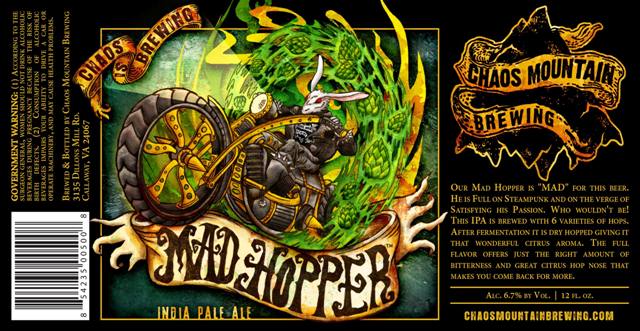
“We wanted a style that was edgy. We have a metal industrial style interior and we were looking for artwork that stood out. It was a collaborative process with Okay Yellow out of Charlottesville. They get our snarky sense of humor. With our name, Chaos Mountain Brewing, we needed something to translate that. We told Okay Yellow our philosophy was Gary Larson’s Far Side meets Monty Python’s Holy Grail.
“As for the labels, our first one was Four Mad Chefs. For inspiration I sent them pictures of my local chef friends and co-workers. They caricaturized them in a fantastic way hovering over the Holy Grail of beer. People describe our artwork almost as tattoo artwork.
“Mad Hopper was more like Alice in Wonderland with an angry rabbit and I wanted something in steampunk. I found this bicycle model made of old watch parts and I found an expression on a mad rabbit, and they changed it to this amazing mad rabbit – or hopper – on a motorcycle with a flaming wheel of hops.”
Another packaging concept regaining strength is the 12-pack variety and sampler packs.
“You get three beers each of four different varieties,” said Hayslette. “That’s a great way for breweries to expose their customers to a variety of products, and it’s a great way for the consumer to sample multiple offerings from that brewery. If you’re just a fan of a brewery’s IPA, but they also have a saison and a black rye beer you can sample that without going out and buying a whole six-pack. Those are quite popular and we’re seeing a lot of that all around the country.”
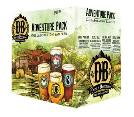
Lexington-based Devils Backbone Brewing Company has had success with its Adventure Pack series. Each Adventure Pack features a mix of core favorites and exclusive specialty styles that are only available at its award-winning Basecamp Brewpub.
“The Adventure Pack recreates the sample experience for everyone who can’t make it to the Basecamp Brewpub,” said Heidi Crandall, Devils Backbone’s co-founder and vice president of branding. “Every recipe is created right there in the original brewery and put on 16 draught lines to enjoy. You can understand the communication of the design and how that came into play, featuring the beautiful environment that Devils Backbone lies in. The glass with our logo is a classic photo taken in the early days. The package brings you right there to with a fresh craft beer just poured.”
For Virginia’s craft breweries, marketing is their identity. It helps them standout of the shelf. The beer in the bottle has to backup that marketing. All agree on that as well.
“I want to emphasize that we know no matter how good your marketing is, great packaging sells the first six-pack but what is inside the bottle sells the second six-pack and beyond,” said Wendy Hallock.