By Jeff Maisey
Smartmouth Brewing Company, with locations in Norfolk and Virginia Beach, is marking its 10th anniversary later this year. Virginia Beer Company, headquartered in Williamsburg, is celebrating its 6th birthday.
Both decided now was the time to revamp their packaging.
Following is an interview conducted with Smartmouth founding president Porter Hardy and Robby Willey, the co-founder and managing member of Virginia Beer Company. Each shares some intriguing insights into how they’re fine-tuning their already successful craft beer brands as they evolve and compete in a crowded field.
VEER: Many established craft breweries have updated their branding in the past couple of years. What led your team to move forward with a brand refresh now regarding flagship cans?
Porter Hardy: We’ve been thinking about it for a while now, but with our 10th anniversary this year it just seemed like the perfect time to give ourselves a little present.
Robby Willey: A lot has changed in six years. The Virginia Beer Company has changed in six years. More beers. More markets. More voices. We have constantly evolved our rotation of offerings (more than tripling the number of beers released per year in the last two years alone) while expanding throughout Virginia, into New York, and overseas. Our physical location in Williamsburg has undergone dramatic changes with expansions, new equipment, and fresh vibes. And our family has grown. We want to make sure that the beers at the core of our business — the recipes that built Virginia Beer Co.’s foundation — are reflective of the evolution, growth, and people that make up The Virginia Beer Company, now and in the future.
VEER: Did you use the same design firm (as your original) for the new packaging or someone new?
Porter Hardy: We interviewed several companies from around the country, but ended up selecting 903 Creative out of Richmond. They have experience with breweries, but work with a number of other industries and we really just gelled with them. We are both small, family-run, Virginia companies and it just felt right from the first conversation.
Robby Willey: This brand refresh has two main objectives. We see it as an opportunity to add elements to our can designs that we felt were lacking in a broader, more modern craft beer market.
But we also wanted to double down on the classic messages that our cans were already sending about our brand. We love that feedback about our cans typically highlights their classic, sleek, and understated elements; which made them feel vintage even when they were originally designed in 2016.
This project at its core is a continuation of doing what we’ve been doing; and as a team, we were confident that the same designer who originally helped us to envision a VBC can lineup that could convey those feelings could accomplish the same again with a sharper, more nuanced approach for 2022.
VEER: When critiquing the old design, what aspects were no longer appealing?
Porter Hardy: The original designs were based on a couple of concepts that we decided to move away from. One, they had a heavy chalk element to them which mimicked the chalk walls in Norfolk. With two breweries now we wanted to move away from that, but retain the artistic and hand-drawn nature of the cans.
Additionally, we had what I call a “cereal-box” effect going on with the original cans. They invited you to pick them up and look at them and see what is going on, which is really cool. This time around though we wanted to grab the customer’s attention from further down the beer aisle. You will see that each of them still tells a story and you’ll want to turn the can to get the whole effect, but it is in a much bigger format.
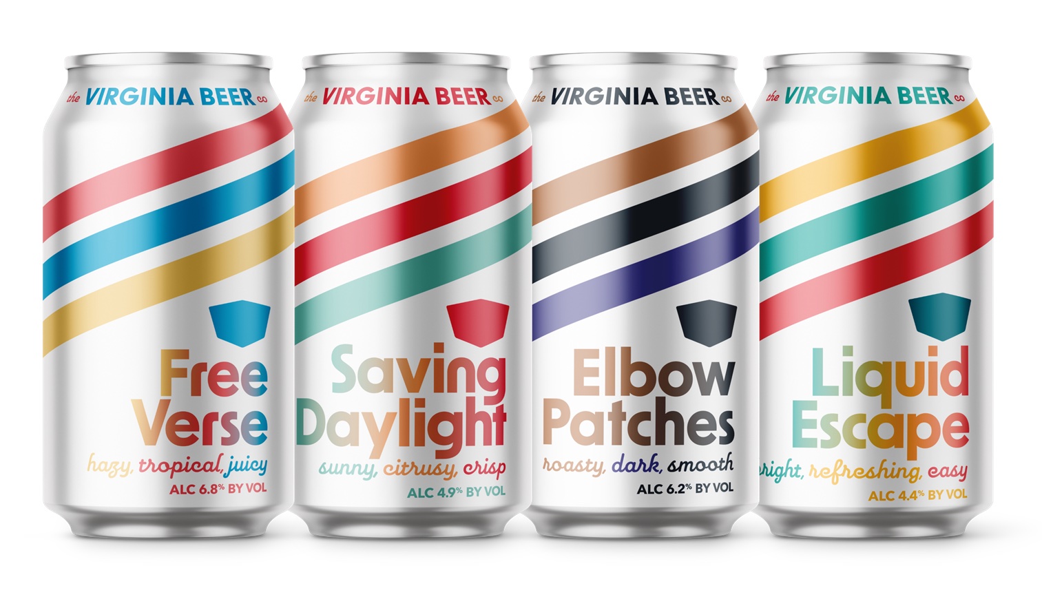
Robby Willey: When we released our first cans, our vision was to elicit a billboard effect. Big, streamlined imagery and word placement set off by alternating colors specific to each brand. And when 6-packs of Free Verse, Saving Daylight, Elbow Patches, Wrenish Rye, and Liquid Escape were displayed together, that lineup made it pretty clear that they were part of the Virginia Beer Co. brand family. The brewery’s primary shield logo was front and center since we were a brand new brewery, and the color of the shield was one of the primary signals to know which beer was contained inside the can.
And while we’re not necessarily a household name, we are now confident in our brand name and that goes doubly for our best-selling recipes. For all the surface area our shield takes up on each can, there is a world of information that can be shared in colors and descriptors. Our original can designs also failed to take into account that while we may intend for one face of the can to be the “front” of the can, when a can is turned, whatever side is facing forward is truly the front. Turning our cans from left to right may reveal information about the beer or the brewery, but you lose the billboard effect and the brand name with a simple swivel. The style of beer was also the smallest detail on the can, which is not helpful in retrospect.
Our aim in addition to a fresh feel was to better utilize the all the spaces on the can (not just the “front”) and to make sure that you’re always aware of what beer you’re about to pick up and enjoy…regardless of the way in the can is facing or how many other VBC cans it’s paired with.
VEER: What guidance did you provide for new design?
Porter Hardy: First it had to be authentic to us. 903 engaged in a series of interviews with our team and some key partners to help us put words to our brand personality before we even started on the design. So, it had to be creative, fun and artistic in a way that really seemed like Smartmouth. We didn’t want to look like everyone else and didn’t want to copy some of the macro stuff going on out there.
Robby Willey: We instructed our graphic designer to “swing for the fences” when it came to this refresh. We provided feedback from our team, our Full-Time Friends, our retail partners, and our distributors. And we included the context that the new can designs would lead to additional projects like cardboard wraps, additional can sizes, a new year-round offering, and auxiliary items like case risers and case boxes…so every detail would need to tie back and forth between every aspect of the project, from can to cardboard and everything in between. The project started as an open canvas with the simple caveat that it needed to tie back to the style and substance that built the brewery’s package lineup in the first place.
VEER: Did your team receive multiple design ideas to select from?
Porter Hardy: Yes, we had multiple rounds for both the framework of the cans and then for each individual label.
Robby Willey: If you could hear laughter through writing, you would hear it across the board here — indeed! It’s our first time doing this in six years, and if all goes well we won’t even be considering another project like this again for another six years (or more)…so we were looking for packaging that spoke to us as a group in 2022. We had a lot of ideas to sleep on, discuss, and sift through. Round after round of submissions led to video calls, impromptu group discussions, and internally created mock-ups…all of which have been part of our weekly routine for the past many, many months.
In fact, where we landed is not where we started at all. Without getting too tied up in the back and forth, this was definitely a lot of group-think and perspective from every angle of the business and every person in the brewery. Fine tuning together over time to help us refine the project and get to a point where we can excitedly prepare to reveal these changes to our friends and fans, new and old alike.
VEER: What are the strengths in the new design that most appealed to your team?
Porter Hardy: One thing is that these cans definitely pop out off the shelf. There is so much going on in the beer coolers at the grocery store that we knew we needed to enhance the size of our logo and work with colors to really stand out and announce our presence. We also wanted the new designs to work with each other and have common elements so they worked when positioned next to each other. Finally, we wanted each can to tell a unique story about the brewery or reflect some aspect of who we are. Each scene depicted on the new designs tells you something about the beer inside whether it is how the name came about, why we made the beer or the beer’s personality.
Robby Willey: “A continuation of what we’re already doing.”
You see before you drink and you decide before you buy, and we feel these new designs blend the vintage feel VBC is known for while also bringing renewed attention to beers that are now recognizable by name or reputation throughout much of Virginia – but not yet by all of Virginia.
It was important to include an aesthetic that felt true to the Virginia Beer Co. brand. Simultaneously, we were looking for a big wave forward to push the brand further while staying true to the spirit of Virginia Beer Co. That’s a tightrope walk that wasn’t lost on the team, and we feel that better use of the entire can, sharper colors, and direct descriptors got us over the finish line.
VEER: What team members weighed in on the decision? Did your distributors play a role?
Porter Hardy: In the brand personality stage of the design we had several members of our staff and ownership weigh in along with a few of our distribution and retail partners. Once we got to the actual designs there are about five or six of us who were more involved with those details.
Robby Willey: A big part of this decision was made because we have more people that make up the VBC family these six years later. Their ideas are valued and we want our shared experiences and voices to be reflected in the future direction of our brewery and branding.
When we first started this venture, it was just me and co-founder Chris Smith. Then brewmaster Jonathan Newman came aboard and we finally opened in 2016. But we’ve been blessed to see our family grow together every year, and our core management team has been with us since our first day — including operations manager Luci Legaspi and director of sales Michael Rhodes.
With a focus on all aspects of the business integrated into this decision making process, we made sure to include the heads of Operations, Sales, and Production in each conversation to present as well-rounded and inclusive a vision as possible to our graphic designer, to our team, and to our customers. That also included keying our distribution partners into our plans – with their feedback and experience in mind as well.
Some of our initial excitement about this refresh has been the reaction we’ve received from our partners at Chesbay, Premium, Blue Ridge, and Carey when we’ve given them the “big reveal” to show off the final results. We’re excited, they’re excited, and we’re ready to share even more beers & cheers together throughout the Commonwealth.
VEER: I’ve noticed in new designs, breweries either prefer the brand logo to pop most or the style name of the beer (ie IPA). Which was the case for you?
Porter Hardy: That is a huge decision, you hit that one right on the head. We spent a lot of time on this. So, if I had to pick, I’d say the brand logo. It certainly is the first thing you see. That being said, I think the style and the actual name of the beer are more prominent on this new design. By cutting down on the doodles from the last can we ended up with more space for both.
Robby Willey: In the grand scheme of things, both play a factor — so our challenge was to tackle all of those components at the same time. The goal is to ensure we are still present for the consumer who already knows us, while concurrently positioning the brand for the consumer that’s new or hasn’t had a Free Verse in far too long. We love the 360° nature of these new cans, and the movement and straightforward nature of the design accomplishes both of these tasks. We’re staying true to our foundation but utilizing splashes of color and pinpoint descriptions to check all the boxes we feel are most important to notice when walking the beer aisle.
VEER: What role did color play in the background or lettering of the design?
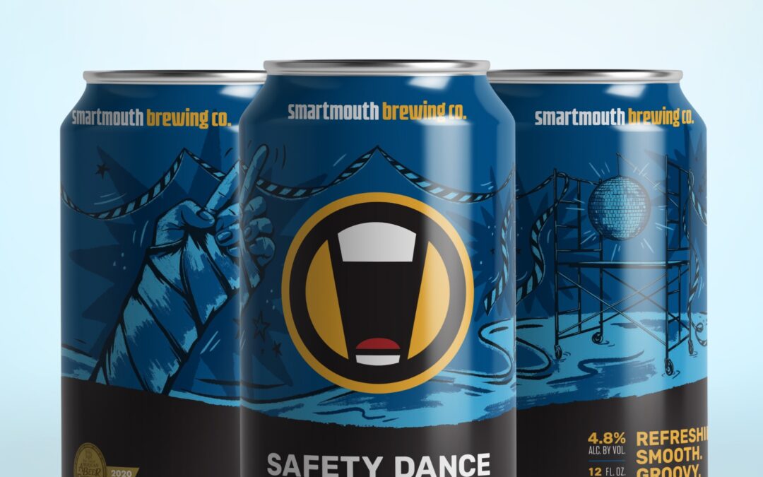
Porter Hardy: A lot of our customers know what beer they like by the can color — so we are keeping those the same, or at least very close. So, if you knew you liked the “blue can” Safety Dance is still blue, Alter Ego will be white and so on. It was really important to keep that consistent. In other aspects of the can, the yellow/orange color in our logo is more prominent which helps them draw your eye.
Robby Willey: As important as the names of the beer in defining the liquid inside, the colors on the can have always been intended to do the same. We took the primary colors featured on every one of our core cans and translated them into these new displays. And we are excited for our fans to see that we’ve “turned on the lights” when it comes to these new flagship designs! An even sharper and brighter focus on the colors that bring our favorite recipes to life — when paired with some additional brand new packaging innovations like cardboard for 6-packs, Free Verse 12-packs, and 19.2 oz. can releases — we hope will make our core cans pop on any shelf, in any cooler, and in every hand.
VEER: Cans are generally displayed/merchandised on retail aisle shelves (like Total Wine), beer coolers (7-11), and in glass door refrigerators behind a bar (80/20 Burger Bar). Do you feel your new design will pop better in these crowded spaces and stand out from the competition?
Porter Hardy: With all the new beers that have come onto the market since 2014 when we launched the original cans, as well as seltzers and RTDs, a central concern was making sure these cans popped off the shelf. So, I certainly hope that these will help you find Smartmouth at your favorite beer cooler and I hope that it draws new customers in to give us a try. There is so much visual noise out there we just felt we had to be bolder.
Robby Willey: The beer shelf at any retailer is noisy, to say the least. There’s a lot of good beer out there. One of the things we love most about The Virginia Beer Company’s refresh is that it jumps in a vibrant way by being more still and intentional. These can designs are focused, razor sharp, and to the point — we hope cutting through the noise to help make the beer buying experience an easy one.
VEER: Remind us again, Porter, why Safety Dance is Smartmouth’s first individual beer brand to get the new look. What is the timeline for each of the others?
Porter Hardy: Safety Dance seemed an ideal fit since it is our most decorated beer (GABF, VA Craft Brewer’s Cup) and a staff and tasting room favorite. Notch 9 will be next followed by seasonals and we will likely end where we began — with Alter Ego. Keep an eye out for a few more branding and marketing initiatives this year too.
VEER: Same question to you, Robby: Why Free Verse Virginia Beer Company’s first brand to get the new look. What is the timeline for each of the others?
Robby Willey: Free Verse has the distinction of being the first Virginia Beer Co. brand rocking the new look in part because it’s our best seller. We’re proud to feature a diverse core lineup that includes a year round Oatmeal Stout, a Citrus Wheat, a Lemongrass Ale, and a Hazy IPA…but in this world, the Hazy IPA still reigns. And because Free Verse is such a popular option across all of our markets, it’s also getting the biggest focus on brand innovations.
Part of the refresh process is getting aligned with our packaging suppliers as well. Timing for printed cans (our first foray into moving from wrapped to printed can formats), cardboard additions, and new can sizes dictates that Free Verse gets the first reveal. Part of the refresh includes the launch of 19.2 oz. single cans of our flagship Hazy IPA this summer. Unveiling this Virginia favorite, in this increasingly popular 19.2 oz. serving size, was a no-brainer…and as luck would have it, the 19.2 oz. cans were ready first, so they’ll be the first to show off the refresh in the biggest, boldest fashion possible. And we couldn’t ask for a better billboard to get this party started.